This thread is inspired by the work being done in this pull request:
Styling is a complicated beast to tame. In my previous attempts in Kludgine, I liked parts of how I designed the styling and theming, but other parts I disliked. It’s kind of funny, I know for a fact, one of the concepts I reimplemented in stylecs I had previously removed from Kludgine. I don’t remember why I removed it from Kludgine originally, so a part of my brain is still worried I’m going to rediscover some reason this was a bad idea.
To adequately describe how styling is working, I want first to take a walkthrough of the crate that I extracted and refined from Kludgine and then give a primer on how Gooey uses the crate.
Introducing stylecs
stylecs is short for Style Component System. It is an attempt at providing a minimalistic approach to the data structures needed to implement extensible styling in any application. It doesn’t directly contain any knowledge of fonts, colors, measurements. If you adopt stylecs directly into your application, you will be responsible for defining the style components your application will use.
At its core is the Style type. If you’ve used an Entity Component System, the interface should look fairly similar to an “entity” in most APIs. You can add components and get components based on their static type.
Each component must implement the StyleComponent trait. A style component is defined with two bits of behavior: should it be inherited in a parent/child context, and what happens when merging two Styles with the same component.
Inheriting Styles
Style provides the merge_with() function, which takes a parameter denoting whether the merge should be considered inheritance. This is useful, for example, in a fashion similar to CSS’s border-* rules: When you set the border of a DOM element in CSS, the child DOM elements don’t inherit the border values. However, when you set the font family on a DOM element, the children inherit that value.
The decision with stylecs was to use the Rust type system to our advantage and allow each StyleComponent to dictate how it is meant to be handled.
For example, here’s how
Merging Components
StyleComponents are meant to be immutable. Still, there are some situations where you might want to merge two Style instances and have the merge operation produce a merge of the contained component. By default, components will overwrite each other based on the order in which they are merged/inherited. However, a component can provide an implementation for merge() to customize the behavior.
Style Component Hierarchies
One of the challenges faced in Gooey is that I don’t want a one-to-one mapping with DOM elements. For example, I might have a FormInput widget with a label and a text edit control. As the consumer of my widget, you have the ability to style FormInput as a whole, but not the individual widgets FormInput is constructing. This is different than in CSS – you can write a more specific selector to target nearly any DOM node.
The proposed solution to this is FallbackComponent. The FormInput widget could expose new style components: FormLabelColor and FormEditorColor. They should have sensible defaults, however, so they implement FallbackWidget using TextColor as its Fallback.
At the point of applying styles, the widget can use style.get_with_fallback::<FormLabelColor>(). If style contains FormLabelColor, its value will be returned. If not, but it contains TextColor, the text color will be returned. Finally, if it has ForegroundColor, that value would be returned. If not, None is returned.
You can see it in action in the Kludgine rasterizer looks up the TextColor component:
options.get_with_fallback::<TextColor>()
StyleSheets
The StyleSheet type is a work in progress – I only began using it in Gooey over the last couple of days.
At the core is the Rule type which offers various filtering options for when to apply the Style contained in the rule. The evaluation is very simple and straightforward – I fear that it will need to become more sophisticated to properly style full applications.
StyleSheets can also be merged, allowing for a user style sheet to be evaluated on top of a style sheet provided by a theme.
How styling in Gooey will work
The module gooey::core::styles re-exports parts of stylecs but also provides some basic style components. Each of the built-in widgets will use these core style components and build atop them. Third-party widgets are expected to use these core style components directly or through the FallbackWidget trait.
The core colors for the built-in StyleSheet are hardcoded right now. I want to abstract this list of colors into some sort of color palette structure. The goal would be to allow you to re-colorize an application by providing a new palette.
Of course, if you want to provide your own StyleSheet and not use any built-in rules, Gooey will support that workflow too.
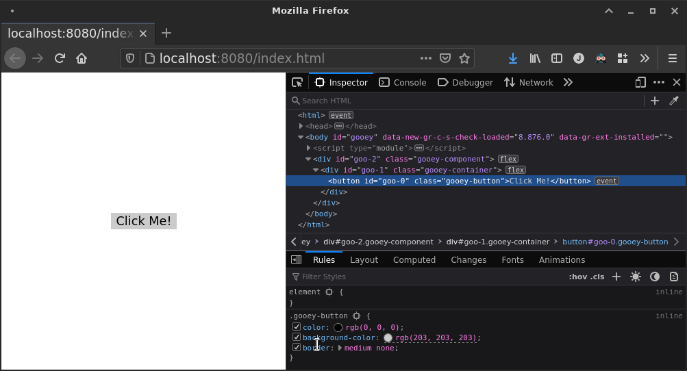
The last thing I want to show off is gooey/examples/basic.rs:
Container::from_registration(builder.register_widget(
    CounterWidgets::Button,
    Button::new(
        "Click Me!",
        builder.map_event(|_| CounterEvent::ButtonClicked),
    ),
))
This chunk is how the example creates a button within a container with an event callback for when the button is clicked. What if you wanted to change the button color?
Container::from_registration(builder.register_widget(
    CounterWidgets::Button,
    Button::new(
        "Click Me!",
        builder.map_event(|_| CounterEvent::ButtonClicked),
    )
    .with(ButtonColor(/* ... */)),
))
I’m very happy with how concise the widget setup and styling API is turning out.
What’s next?
The pull request will be updated with a ToDo list as I start reigning in my vision. I try to keep pull requests focused, and this one has an opportunity to grow unwieldy if I don’t set some goals soon.
The next missing piece is that all of this style information isn’t handled in the browser implementation. I have a few ideas on how I’m going to approach this. It’s not actually a tough problem per se. Rather, it would be easy to implement inefficiently.